The Probabilistic Interpretation of AUC
In this note I’d like to give proof to a well known probabilistic interpretation of the AUC model fit statistic. I’ve had trouble locating an intuitive proof of this result online and in the literature.
This argument is entirely due to my co-worker Jack Bennetto, I’ve just made some figures and typed it up.
The AUC
The AUC is a popular measurement used for comparing goodness of fit of classification models in machine learning. The AUC makes sense for any model that produces a scoring of the data points in a set, with the model assigning a higher score to those data points it feels are more likely to belong to the positive class. The most popular ranking models actually estimate conditional probabilities of class membership:
To calculate the AUC of a model (on a dataset), we must first draw an ROC curve. This curve is produced by thresholding the model’s predicted probabilities at various places between zero and one, and taking the points scored above the threshold as predicted members of the positive class, and those below the threshold as predicted negative classes. The proportion of positive classes correctly predicted is called the true positive rate of a thresholding, and the proportion of negative classes incorrectly predicted is called the false positive rate. Each threshold then produces a pair
Plotting all of these pairs as the threshold is varied across its range traces out the ROC curve.
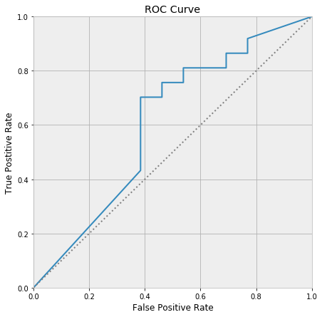
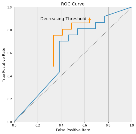
The ROC curve always passes through (0, 0) and (1, 1), and decreasing the threshold moves up along the curve towards (1, 1).
The AUC is the area under the ROC curve. It is a number between zero and one, because the ROC curve fits inside a unit square. Any model worth much of anything has an AUC larger than 0.5, as the line segment running between (0, 0) and (1, 1) represents a model that randomly guesses class membership.
The AUC seems arbitrary when first encountered. It certainly has some nice properties, but it has an ad-hoc and slapdash flavor, and it’s unclear if it is attempting to communicate anything essential about the world. Luckily, the AUC has a very nice probabilistic interpretation:
The AUC is the probability the model will score a randomly chosen positive class higher than a randomly chosen negative class.
Our intention here is to give a proof to this fact.
Proof
We will give a geometric proof by setting up a lattice in which the lattice points under the ROC curve correspond to those pairs of positive and negative classes in which the model ranks the positive class higher than the negative class.
Consider the following diagram:
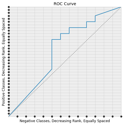
We have layed the positive classes in our dataset equally spaced along the y-axis. The positive data point ranked highest by the model is placed closest to (0, 0), and the model score of the data points decrease as we move in the positive y-direction. We’ve neglected to lay a point at (0, 0), which is a technical detail that helps the counting work out.
The same was down with the negative classes, this time along the x-axis. If the coordinates of these two layouts are taken together, the result is a rectangular lattice in the square, which is also pictured.
Now consider picking a random positive class, coloring it orange, and drawing the horizontal line through the square that leaves from that point. Say that this is the $k$’th positive class.
This horizontal line first meets the ROC curve at one of the lattice points, the green point below:
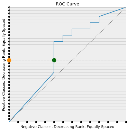
Since the y-coordinate of a point on the ROC curve is the true positive rate at the threshold producing the point on the curve, the true positive rate at the green point is its y-coordinate
But the positive classes were layed down along the y-axis in order of decreasing score, so the actual points that are correctly classified to produce this true positive rate are the first $k$ points along the y-axis. Consequently, the threshold corresponding to the green point on the ROC curve is the minimal possible threshold that classifies the orange point correctly (i.e. as a positive class).
The same is true for a randomly chosen point along the x-axis. The threshold associated with the point along the ROC curve where a vertical line drawn from the point meets is the minimal possible threshold incorrectly classifying it as positive.
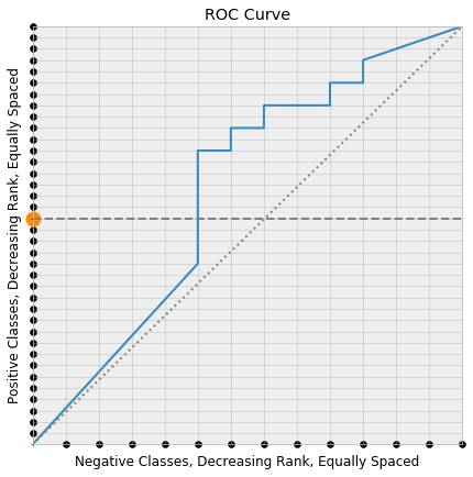
Now consider choosing two points
- A random positive class along the y-axis.
- A random negative class along the x-axis.
and drawing the corresponding horizontal and vertical lines.
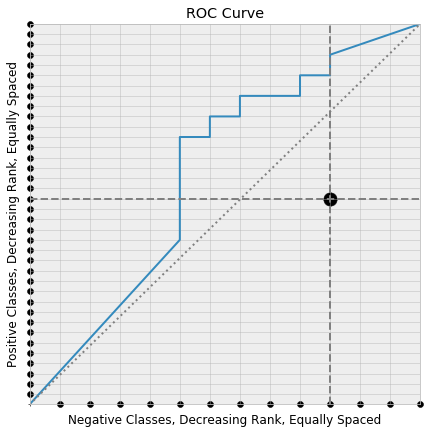
Recall that the associated thresholds decrease as we move along the ROC curve towards the top-right corner. So, if the horizontal line meets the ROC curve to the left of the meeting with the vertical line, than the chosen positive class is scored higher than the chosen negative class. Under this setup the horizontal and vertical lines meet at a lattice point under the ROC curve. If the roles had been reversed, then the positive class would be scored lower than the negative class, and our intersection point would lie above the ROC curve.
Every lattice point under the curve is produced in this way: from those pairs of positive and negative classes in which the positive class is scored higher than the negative classes. So the proportion of pairs in which the positive class is ranked above the negative class is the same as the proportion of lattice points that lie under the ROC curve. It’s easy to see that this proportion of lattice points is the area under the ROC curve, which completes our proof.